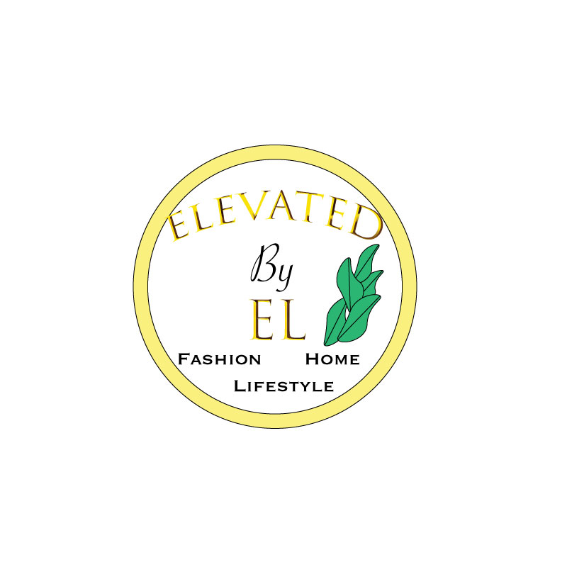
For my brand, Elevated by El, I decided to create a logo that is simple yet clear on what the brand is about. I really like gold, and I like white and gold in a lot of my designs and decor, so I decided to go with that. The small plant represents the idea that people can always grow. Not to mention that plants are essential in home decor, my brand will promote eating a plant based diet, and will also encourage natural products over chemicals. I liked the gold big font for the name, but I wanted something simple that could stand out when scaled for the “Fashion, Lifestyle, Home” at the bottom. I wanted to focus on simplicity and unity, but also boldness when it comes to design. I can be sort of wordy and detail oriented so it was a bit challenging to make the logo something that would be simple but also gives viewers somewhat of a clue as to what the brand represents. My design process was sketching out a general idea, as posted on my “Logo Sketch” blog. I then started playing around with shapes and experimenting with different fonts in illustrator. I then tried to figure out how to make a plant, and it proved difficult, so this may be something to revise later…but at least it seems original. Finally, I revised the design multiple times until I was generally pleased with the result. To create the elements in my design, I used the circle tools, text tools, warp text options, various font and fill options and keyboard shortcuts such as holding down shift to make sure things are even. For the leaves, I experienced with changing the circle shape and adding/editing anchor points and curves. I found difficulty adding a gradient effect to the gold circle and leaves. I’m not sure if I want to do that for my final draft because since my logo has plenty of words, I don’t want the eye to be drawn everywhere and have there be too much going on, but I need to watch the tutorial on how to add gradient effects again because it is a good skill to know.

This is such an eye catcher and it looks incredible! By far my favorite thing about your logo is the gold shining through the black script, it makes it so unique and I don’t think I have ever seen a logo using those two colors and I think it is something that is a really neat idea. The script you chose is nice as well, Though I do think that it would look a little brighter if you make the black only type a little thicker or bigger, specifically the “by” would make it pop a bit more. The other suggestion I have is that the yellow in the outer ring is pretty but I think it would completely change the logo in a bigger eye catching way if you did the color the same as your gold and black spelling. I think both ways look awesome and I cannot wait to see what your final product looks like! Great job!
LikeLike
Thank you so much 🙂 I appreciate your kindness and the feedback!
LikeLike
First of all, I want to say great idea for a logo, very clean, no clutter and easy to identify. I think the plant is perfect for a logo, the only thing I would do was add a stem or something that would clarify that it is a plant. The one thing that I really like is your use of font and gradient to give it that made from gold look. I really feel this is the strongest side of your logo, even though you said you need to watch more tutorials on using the gradient tool.
One change I would make was to make the font a little smaller or the circle a little bigger. They also seem a little off center. The second change would be the order of “Fashion Home Lifestyle”. To make it look more even I would switch the home with lifestyle. This would make it look more symmetrical, and possibly make the other wording look centered. I really like the logo, like I said above, very clean and uncluttered. It was something that I tried to do but couldn’t find a good way to do it with my design.
LikeLike
Elena,
I think this logo shouts simple and sophisticated! I really like the use of color and gradient throughout your whole project. Since your project is clean and simple it makes it easy to read. I can tell you put time into making this a quality piece. If I was to make any suggestions, I would start by balancing your logo. I really like your use of imagery on the right side of your logo, so maybe mirroring that to the left side would balance your logo a little more. Also, I do think the circle needs to be a tad bigger. Right now, it almost looks like the words don’t fit into the circle. These are just suggestions for you, but I think your logo looks really pretty. It’s a very memorable piece. This logo represents a design business with its tasteful style.
LikeLike