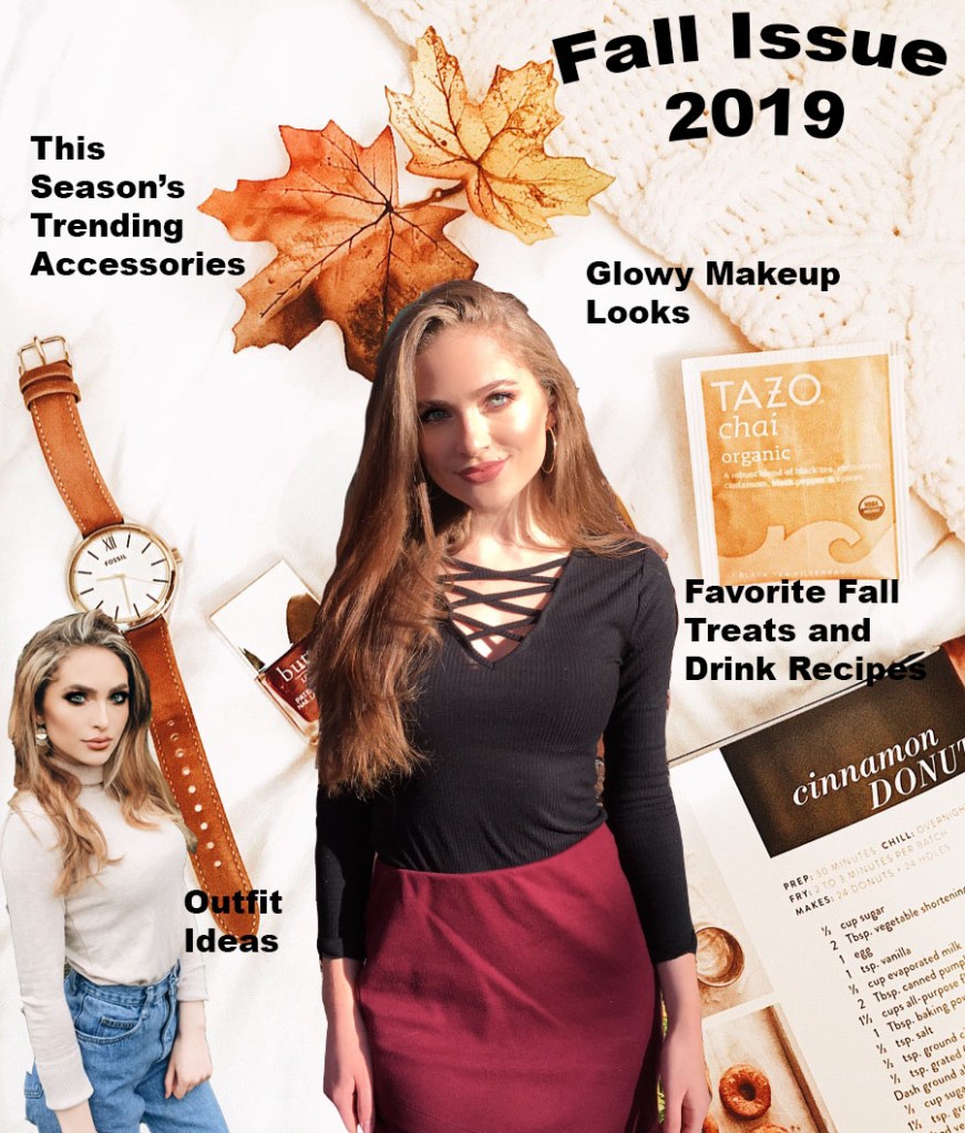
For this assignment, I tried to create a magazine cover. This relates to my topic of fashion because it is supposed to be a fall fashion magazine issue. I had my sister take two photos of me in my favorite fall outfits for my use, and with permission of course to use them, cropped and edited the photos to fit the way that I wanted on the cover. I have always liked to read fashion magazines that were geared towards my age group when I was a teenager, such as Seventeen Magazine, J-14, and more. Most inspiration is from one of my favorite sections in the magazine, which is the clothing piece recommendation section/fashion advice. I liked seeing what was trending, and lately “mom-jeans” have been in style, so I decided to include an outfit with that style on the “cover” of the magazine.
For the background, I arranged some of my favorite fall items on a white background with a textured blanket, and edited it to be clearer and brighter. The background has my favorite brand of chai tea, a peak of a fall donut recipe, one of my favorite watches to wear in the fall, a maroon colored nail polish (because of fall color trends but also Go Cougs…) and simply some decorative leaves. These were all materials I have myself so it was nice to be able to design something around that.
As far as tools and techniques used, I mainly created different layers after cutting out the outfit pictures using the magnetic lasso tool. Then, I dragged and placed the photos onto the background where I wanted to put them, and used the “free transform” tool to size them correctly. I then used the add text tool to add the words, and bent the text to make the cover stand out more. When it comes to design, I tried to choose cohesive colors that go well together and embrace a sense of unity in design. Some technical problems I had were trying to figure out how to highlight text, in the end I decided it would look better without that effect. I also had a difficult time just getting used to all of the different layers and tabs.

Upon closer attention to detail, I realized the photo of me on the bottom left corner appears to portray me as missing a back pocket–oops. I will work on more precisely cutting out that photo in particular. I like how all of the colors seem to go together pretty well. I can not decide if I should make the fonts more interesting, or maybe italicized, or if I should leave it simple so it doesn’t overcomplicate an otherwise simple magazine design. I want to move where it says “Outfit Ideas” at the end of the watch, I don’t like where that text is placed for some reason. I will move it to the blank space. Now that I think about it, maybe I should put my brand name or magazine name over or under the Fall Issue text, because that seems pretty generic.
LikeLike
Elena,
Your magazine cover is awesome! I really like how you included so many layers. At first glance, this is fantastic. To find any critiques I have to look very closely, but I think you should change the color (or move) the words “Favorite Fall Treats and Drink Recipes” because the black color is blending in a bit with the background. I liked reading your comment and made note about the font. In my opinion, the font you have is clean and simple with a creative environment around it. I wouldn’t change the font drastically because it might get muddled with the rest of the page. The big bold writing helps direct my attention to the text first. Essentially, your cutting and cropping is really good and you already noticed parts that needed to be altered! This was a fun project to read about!
LikeLike
Hi Elena, I love your magazine cover. I really like the color scheme you did to match your “Fall Issue”. I really like how you have organized it all. The suggestions I would make would be to blend the two photos of you more into the background. You really did a great job at it way better than I did that for sure. The other suggestion would be to place the text that says “favorite fall treats and drink recipes” a little higher because the end of the last word is a little hard to read because it is a dark color on top of a dark color. I like how you chose the two photos of you to match the area on you magazine cover. I feel like your photo in the left hand corner matches the color around it perfectly as well as the center photo having that sunshine on your face near the yellowish tea bag and next to the text that says “glowy makeup looks”. Great job!
LikeLike