Author: elenagrace98
Audition Tutorials
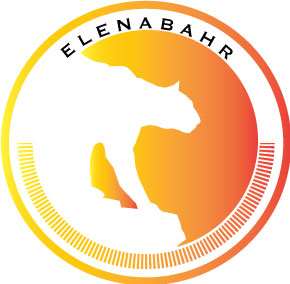
Final Logo Project
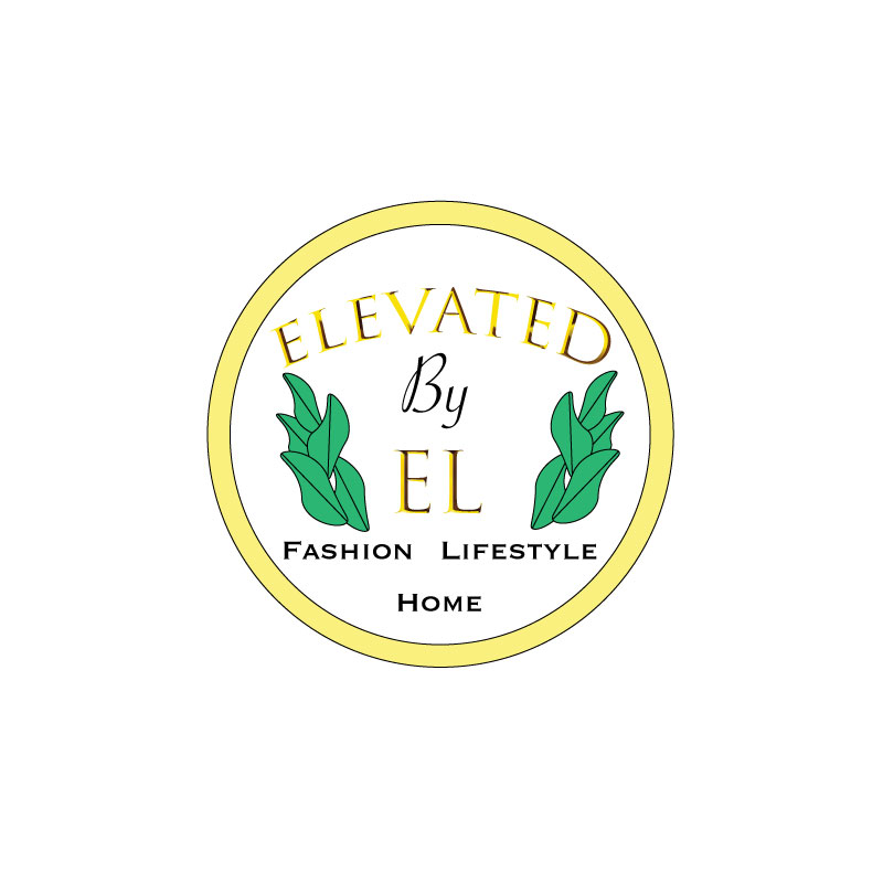
This is my finished logo for my brand, “Elevated by El”. Upon creating my initial draft logo, I knew I wanted to incorporate gold and white, with a pop of natural green. I wanted my logo to be fairly simple but also be able to portray what the brand is about.
I started by creating shapes and texts in illustrator, and combined various shapes for the plant leaves. I experimented with different fonts and styles to see what I thought best fit and represented a beauty/fashion/lifestyle/design company. I wanted there to be a sense of balance in the logo, which is where the revisions came in. Some helpful tips from my classmates were to balance the logo by doing two of the plants instead of just one on the right. I did that and I agree the logo is much better balanced. Another tip I got was to just swap the order of the words, “Fashion, Home, Lifestyle” to better balance the logo.
I also fit the text better inside of the circle background, where as in my draft it looked a bit cramped. I am grateful for my peers’ feedback, as I believe I was able to greatly improve my logo with relatively small edits.
Now, I believe that my logo could represent my brand in a more effective and aesthetically pleasing way.
Draft Logo
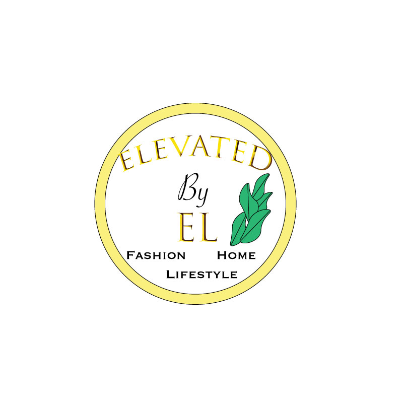
For my brand, Elevated by El, I decided to create a logo that is simple yet clear on what the brand is about. I really like gold, and I like white and gold in a lot of my designs and decor, so I decided to go with that. The small plant represents the idea that people can always grow. Not to mention that plants are essential in home decor, my brand will promote eating a plant based diet, and will also encourage natural products over chemicals. I liked the gold big font for the name, but I wanted something simple that could stand out when scaled for the “Fashion, Lifestyle, Home” at the bottom. I wanted to focus on simplicity and unity, but also boldness when it comes to design. I can be sort of wordy and detail oriented so it was a bit challenging to make the logo something that would be simple but also gives viewers somewhat of a clue as to what the brand represents. My design process was sketching out a general idea, as posted on my “Logo Sketch” blog. I then started playing around with shapes and experimenting with different fonts in illustrator. I then tried to figure out how to make a plant, and it proved difficult, so this may be something to revise later…but at least it seems original. Finally, I revised the design multiple times until I was generally pleased with the result. To create the elements in my design, I used the circle tools, text tools, warp text options, various font and fill options and keyboard shortcuts such as holding down shift to make sure things are even. For the leaves, I experienced with changing the circle shape and adding/editing anchor points and curves. I found difficulty adding a gradient effect to the gold circle and leaves. I’m not sure if I want to do that for my final draft because since my logo has plenty of words, I don’t want the eye to be drawn everywhere and have there be too much going on, but I need to watch the tutorial on how to add gradient effects again because it is a good skill to know.
Logo Sketch
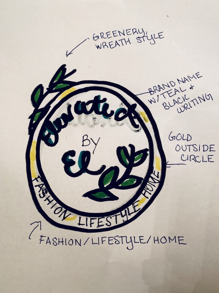
Here is a rough sketch for my logo. I plan on having it in the shape of a circle, white with gold on the outside, some green leaves surrounding it and the brand name, Elevated by El. Underneath it will say “Fashion, Lifestyle, Home” to get a general idea of what the brand is about.
Illustrator Tutorials
Final Graphic Design Project
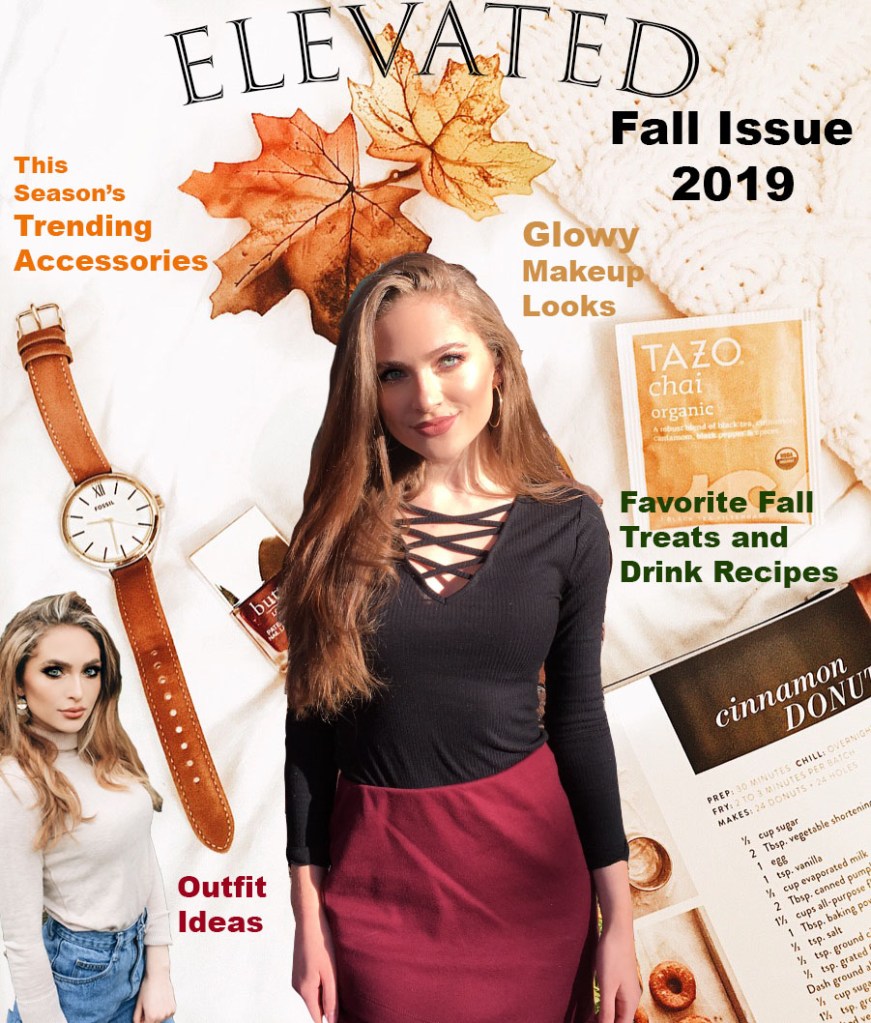
This is my revised magazine cover. I decided to name my magazine “Elevated” because I decided to call my brand “Elevated by El”. It is a fashion, interior design, and lifestyle magazine that encourages everyday women to be the best versions of themselves. It includes ideas when it comes to favorite recipe finds (hopefully these will mostly be healthy, but I had to include one I found for donuts…sometimes you just have to treat yourself), fitness, style, beauty products, activities, career advise, home decor and organization, and more. I’ve always wanted to start a youtube channel discussing these things, so this magazine cover was a fun way to express my interests.
Taking into account my own revision ideas and the ideas of others, I have re arranged some things slightly so that everything can appear more clear (in the draft, sometimes the words blended with the background). I have also added a cover and since I realized most magazines have various text colors, I fixed that too. I chose colors that gave off fall vibes and went coherently with the photos, hopefully enhancing the sense of unity. I decided to keep the slightly unblended lines, because I feel like it gives it more of a 3D, magazine style “pop”. I do not want it to blend into the background.
I have never used photoshop like this before, and I know there is much to learn and be improved upon, but I had a fun time designing this magazine cover, and I’m over all happy with how it turned out.
Photoshop Draft Assignment
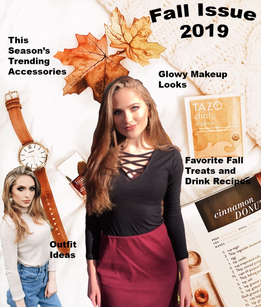
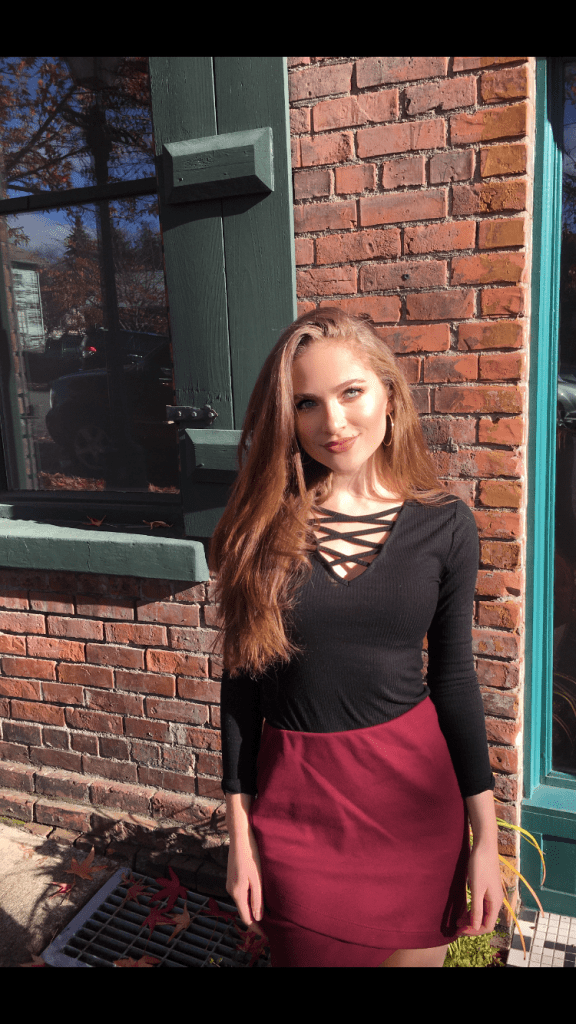
For this assignment, I tried to create a magazine cover. This relates to my topic of fashion because it is supposed to be a fall fashion magazine issue. I had my sister take two photos of me in my favorite fall outfits for my use, and with permission of course to use them, cropped and edited the photos to fit the way that I wanted on the cover. I have always liked to read fashion magazines that were geared towards my age group when I was a teenager, such as Seventeen Magazine, J-14, and more. Most inspiration is from one of my favorite sections in the magazine, which is the clothing piece recommendation section/fashion advice. I liked seeing what was trending, and lately “mom-jeans” have been in style, so I decided to include an outfit with that style on the “cover” of the magazine.
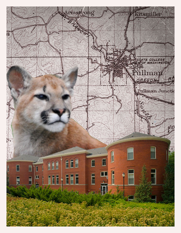
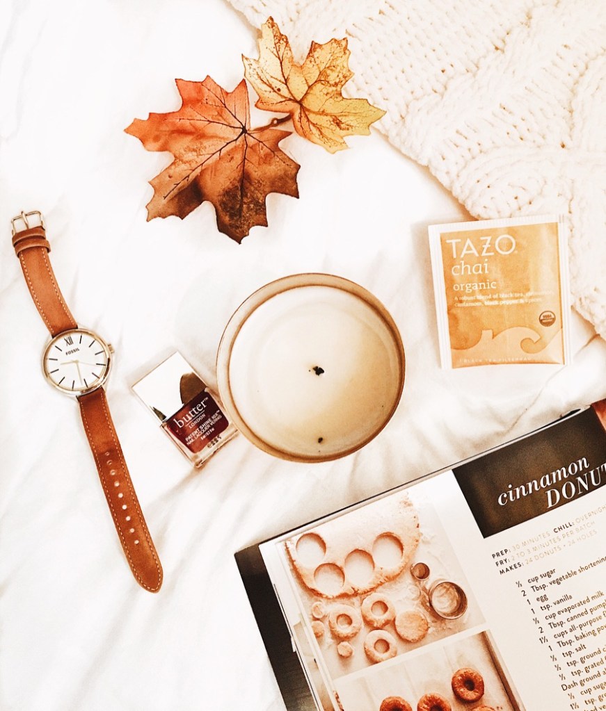
For the background, I arranged some of my favorite fall items on a white background with a textured blanket, and edited it to be clearer and brighter. The background has my favorite brand of chai tea, a peak of a fall donut recipe, one of my favorite watches to wear in the fall, a maroon colored nail polish (because of fall color trends but also Go Cougs…) and simply some decorative leaves. These were all materials I have myself so it was nice to be able to design something around that.
As far as tools and techniques used, I mainly created different layers after cutting out the outfit pictures using the magnetic lasso tool. Then, I dragged and placed the photos onto the background where I wanted to put them, and used the “free transform” tool to size them correctly. I then used the add text tool to add the words, and bent the text to make the cover stand out more. When it comes to design, I tried to choose cohesive colors that go well together and embrace a sense of unity in design. Some technical problems I had were trying to figure out how to highlight text, in the end I decided it would look better without that effect. I also had a difficult time just getting used to all of the different layers and tabs.
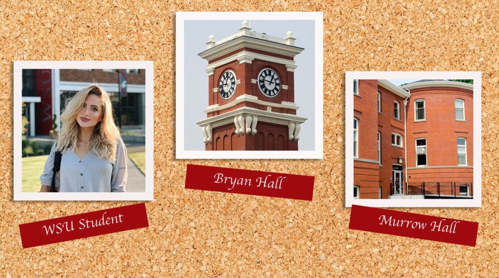
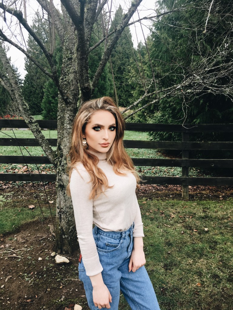
Image Collection
These are the three required images I have chosen to use for the first graphic design project. I am thinking about making a magazine cover about the topic of fall fashion.
Photoshop Tutorials Assignment
Here are my completed tutorials.