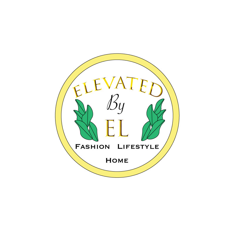
This is my finished logo for my brand, “Elevated by El”. Upon creating my initial draft logo, I knew I wanted to incorporate gold and white, with a pop of natural green. I wanted my logo to be fairly simple but also be able to portray what the brand is about.
I started by creating shapes and texts in illustrator, and combined various shapes for the plant leaves. I experimented with different fonts and styles to see what I thought best fit and represented a beauty/fashion/lifestyle/design company. I wanted there to be a sense of balance in the logo, which is where the revisions came in. Some helpful tips from my classmates were to balance the logo by doing two of the plants instead of just one on the right. I did that and I agree the logo is much better balanced. Another tip I got was to just swap the order of the words, “Fashion, Home, Lifestyle” to better balance the logo.
I also fit the text better inside of the circle background, where as in my draft it looked a bit cramped. I am grateful for my peers’ feedback, as I believe I was able to greatly improve my logo with relatively small edits.
Now, I believe that my logo could represent my brand in a more effective and aesthetically pleasing way.
